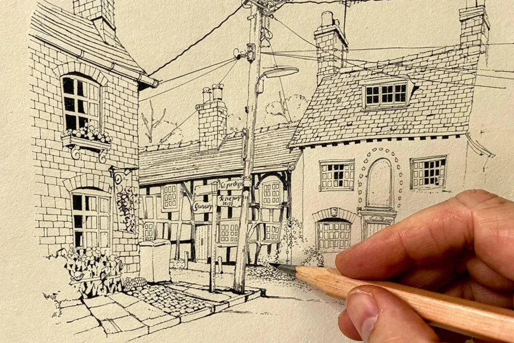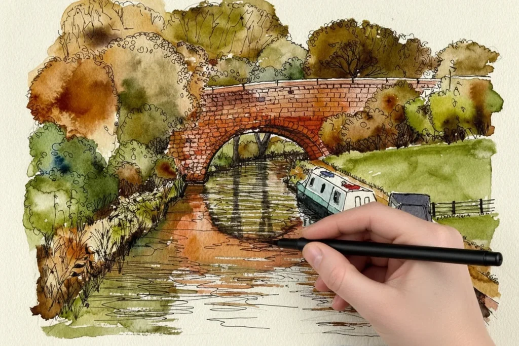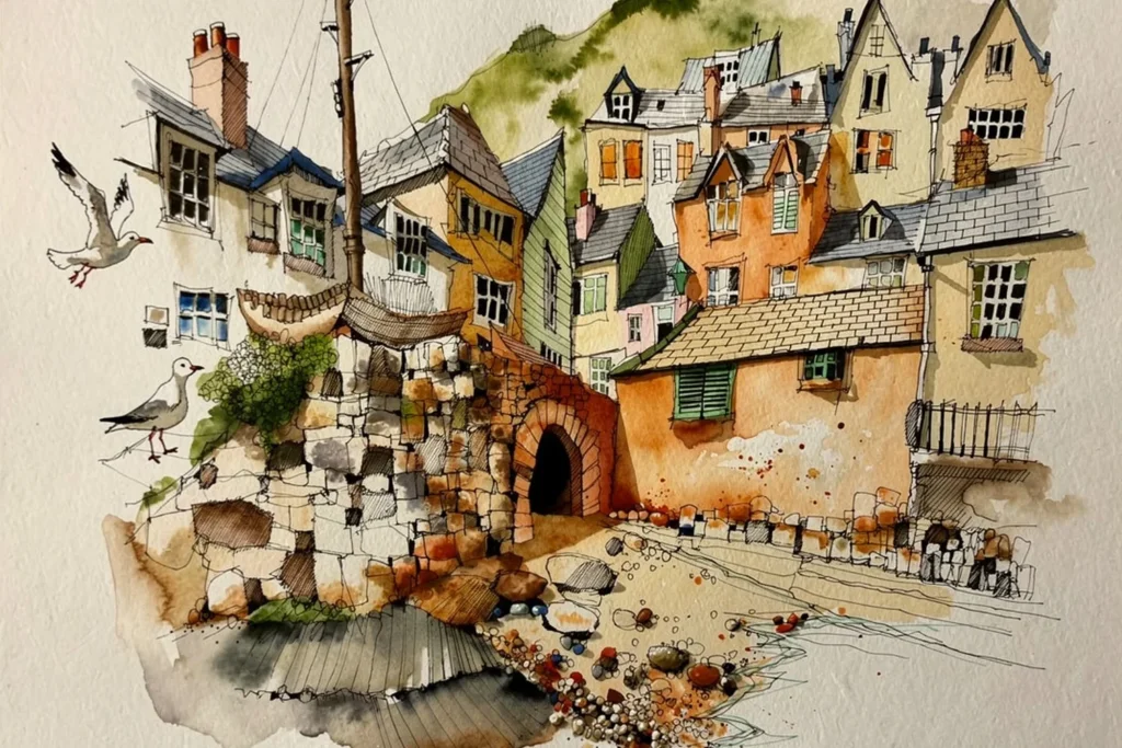
A limited palette means working with only a few colours and learning everything they can do, instead of owning every tube in the shop. It is the quickest way I know to make your paintings look harmonious, because every colour on the page is related to the others.
Why use a limited palette?
Most students arrive at my workshops with a vast array of colours and beautiful pristine palettes. Mine is the opposite. I keep a deliberately limited range, and every colour on it is one I actually use. I do not believe in carrying colours for the sake of it.
There is a practical reason too. When you are painting live, your mind is already processing a huge amount: brush choice, water, pressure, direction, how colours interact, tonal range. The last thing you want to be wondering is where a colour lives. I keep my palette the same way round every time, so after years of painting I reach for a colour without thinking about it.
Which two colours should I start with?
Start with two complementary colours, which sit opposite each other on the colour wheel. My favourite pair is ultramarine blue and burnt sienna. Mixed together they cancel each other out into a beautiful neutral grey, and I use that combination everywhere.
How do I explore what two colours can do?
This is the exercise I would give you first. Draw a grid of eight squares, two rows of four, and use only ultramarine blue and burnt sienna.
- Box one: lots of ultramarine, a small amount of burnt sienna. Go over it with water so the mixing happens on the paper. The result is dark, neutral and weighted towards blue.
- Box two: the same again, but with much more burnt sienna. Same two colours, different proportions, and now it reads as brown.
- Box three: add white. It lifts the whole mix into a completely different range, and the three together harmonise beautifully.
- The remaining boxes: carry the same mix forward, nudging it towards more blue, more brown, or more white. In the last boxes, get the same lightness without white, by loading the brush with plenty of water and the tiniest amount of pigment, and let the white of the paper come through.
The point is to force yourself to work two colours properly: different proportions, with and without white, with more or less water. Eight variations from two colours.
What do I do with the finished grid?
Put the sheet up in your studio. The next time you use those two colours in a sketch, you have already mapped all the territory, and you know what they can do.
How do I mix a neutral grey that suits my painting?
Mix the two colours together until they start cancelling each other out, then add white if you need to lift the tone. Adjust as you go. The truer the complementaries, the more completely they neutralise. The less truly opposite they are, the more colour bias is left in the mix. For example, I once paired a greenish blue with a gold and got a green rather than a grey, because those two are not real opposites on the wheel. That is useful to know too.
Grey mixed from your own colours will always sit comfortably next to them, because the same colours are already in the picture.
Can I use even less colour?
Yes. In a sketch of the back streets of Porto I used almost none. Just burnt umber, very transparent, for a warm wash, and a cool grey brush pen to counterbalance it. Warm and cool together give a quiet harmony rather than a flat monotone. Taking colour almost out of the equation sharpens your eye: you stop asking whether the wall is terracotta or cream and start thinking purely about value.
What goes wrong?
- Too many colours. The more you carry, the less you know any of them. Learn a few well.
- Mixing on the palette until it is mud. Mix on the paper where you can, and stop earlier than you think.
- Choosing a pair that are not true opposites. You will get a coloured mix, not a neutral. Test first on scrap paper.
Try this today
Pick ultramarine blue and burnt sienna. Draw your eight boxes and fill them in as above. It takes about twenty minutes, and you will paint with more confidence for the rest of the week.
Where does this fit in the four-stage process?
Colour choices belong to Stage 2 of the four-stage process I use in all my courses: Big Shapes, Watercolour, Tone and Shade, Detail. See adding watercolour to the big shapes outline for how the washes go on. If you want to go further with primaries, a full set of complementary pairs, white space, abstract versus local colour and splashing, my paid Colour Mixing and the Palette bundle takes you through all of it. You can also explore all the painting workshops.
Free course, opening soon
Ready to paint your first complete picture?
This free course takes you through every stage, from first pencil mark to finished painting. It is not open just yet: leave your email and I will let you know the day it opens.
Notify me when it opens