Adding watercolour to a big shapes outline means laying broad, expressive washes of colour over the structure you drew in Stage 1, so the colour supports the shapes instead of decorating them. It is Stage 2 of my four-stage process, and it is where the painting comes alive, and where most people surprise themselves.
What you'll need
- A big shapes drawing from Stage 1
- A small palette: I work with two blues and two warm colours
- Flat brushes in large, medium and small, plus a round brush or two
- Watercolour paper, and a scrap piece to swatch your colours on
How do I choose my colours?
I work with a carefully chosen palette, selecting colours that feel right rather than colours that are literally correct. Grass might be blue. Shadows might be warm. A wall might carry hints of colour you would never see in a photograph. The goal is not accuracy, it is atmosphere.
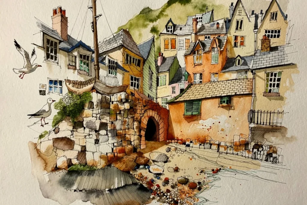
I keep the palette tight. For my Polperro course it was magnesium brown, transparent orange, ultramarine blue and cerulean: two blues and two warms, and the play between those two families of colour is what I wanted to explore. I swatch the colours on a piece of watercolour paper first. It helps me remember the names, and it helps you see what you are working with before the chaos begins.
It is not the choice of colour that matters most. It is how the colour goes on, how the colours play against each other, what the tonal value is, and where they sit on the page. A yellow building does not have to be exactly that yellow. It occupies that shape, it is light, and it gets richer as it moves down towards the pavement. Colour choices should be based on what the picture needs, not on reality.
Emotion finds its way in too. When I sketched New Brighton in February, and Amsterdam on a cold, exposed canal, the colour went warm both times, because I wanted to warm myself up. That is not a mistake. That is painting.
Which brushes do I use?
The large flat brush is for big washes, covering ground quickly, wet on wet: you load the brush, lay in the colour and let it bleed and move. It does exactly what Stage 2 needs, which is broad, expressive, non-literal colour laid down with confidence. The medium flat gives you more control while still allowing a generous wash, so you start describing areas rather than just filling them. The small flat is the one I use most. You can pull it sideways to describe a wall, push it into a corner, or drag it along a line.
Hold the brushes loosely and let the weight of the brush do the work. You get a lighter, more luminous touch that does not disturb the layers underneath. Grip lower and push, and you get more defined edges and stronger marks.
A round brush is a different tool: it gives you a precise point that widens as you press and fades as you release, which is useful for specific shapes. Practise with any new brush before you take it on location. Pick up a mop brush without knowing how it behaves and you will flood the painting.
How do I lay the first washes?
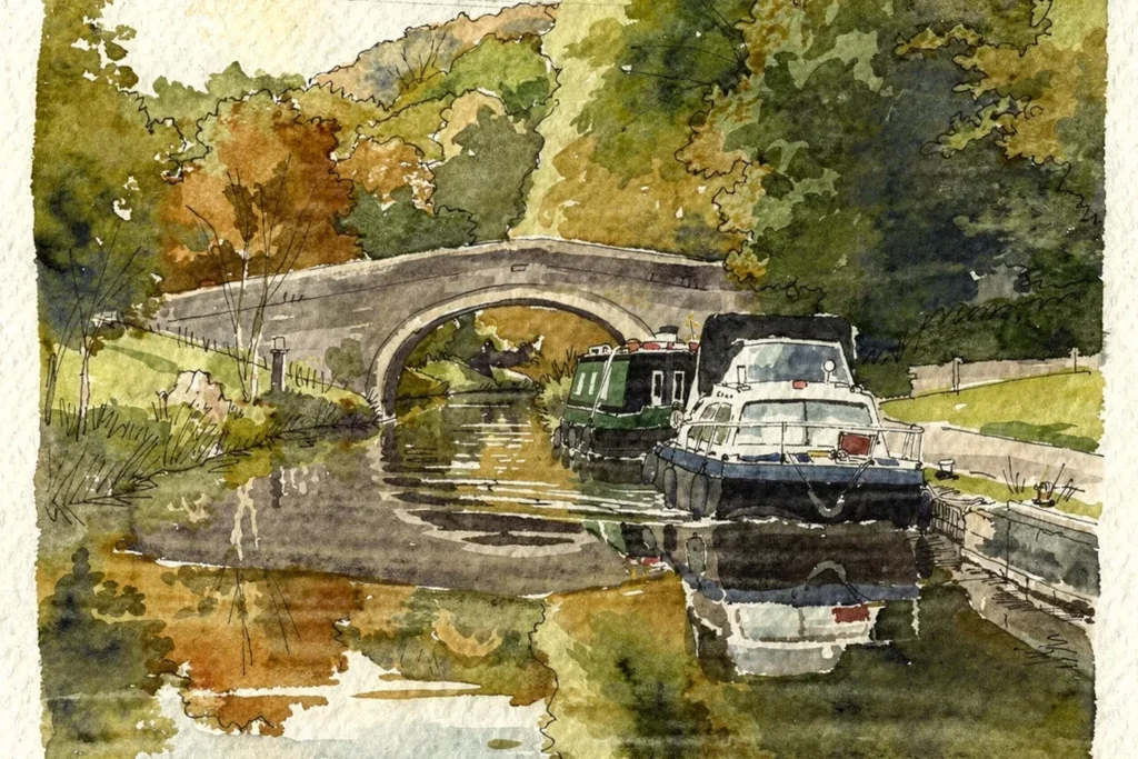
- Start with your anchor colour on the biggest shape. On my Polperro painting it was the magnesium brown on the bridge.
- Bring the second colour in from the other side. I dragged ultramarine blue down into the foreground and let the two colours meet and blend.
- Work wet on wet with the large flat, quickly and broadly, and do not try to colour in the lines.
- Mix on the page rather than on the palette. It gives you much more control over the tone, and it keeps you mindful of the white paper showing through.
How do I make a colour fade out softly?
Blending turns up again and again, so it is worth practising on its own. Put down a strong, precise mark of ultramarine blue with a round brush, deep and saturated. Load the large flat brush with water, not too much, then lift the water into the edge of the blue and let it bleed in. Do not push. Use the weight of the brush and let it go where it wants to go.
It gives you a wonderful sense of three-dimensional space: a colour that appears and then gently dissolves, like a sky bleeding up into the horizon, or the corner of a wall receding into shadow. Like most things in watercolour, it rewards practice. The more you do it, the better your feel for how much water to use and exactly when to stop.
Why should I leave some white paper?
The white is not really planned, it is preserved. You are painting around it, guarding it as you go. This is a coloured sketch, not a painting, so you want a lot of white to remain. When you come back in with the pen at the end, you want some of the ink sitting on bare white paper and some sitting on top of colour. That variety, pen on white and pen on paint, is what stops it looking flat.
When should I stop?
Earlier than you think you need to. Watercolour is such a lovely thing to do that you want to carry on long after you should have stopped, and the page goes from fresh and light to overworked and muddy. Stop, and let the next stages do the rest: the tone comes in Stage 3 with the brush pens, and the pen comes in Stage 4.
What goes wrong?
- Overworking it. Keep going and fresh turns to muddy. Stop earlier.
- Copying the colour you see. Paint what the picture needs: how the colours play against each other and where they sit on the page.
- Gripping the brush tightly. You lose the light, luminous touch and disturb the layers underneath.
- Using a new brush for the first time on a good sketch. Experiment in the studio first, especially with a mop brush.
Try this today
Take a big shapes drawing and pick two blues and two warm colours. Swatch them on a scrap of watercolour paper. Lay your anchor colour on the biggest shape, bring the second colour in from the opposite side with a large flat brush and let them meet. Leave plenty of white paper showing, and put the brush down earlier than you think you should.
Where does this fit in the four-stage process?
Watercolour is Stage 2 of the four-stage process I use in all my courses: Big Shapes, Watercolour, Tone and Shade, Detail. It follows simplifying the scene into big shapes and comes before adding tone with brush pens. To see the whole process on a real subject, my free Beddgelert Bridge course works through every stage (it is opening soon, and you can leave your email on that page to hear when it does). You can also explore all the painting workshops.
Free course, opening soon
Ready to paint your first complete picture?
This free course takes you through every stage, from first pencil mark to finished painting. It is not open just yet: leave your email and I will let you know the day it opens.
Notify me when it opens