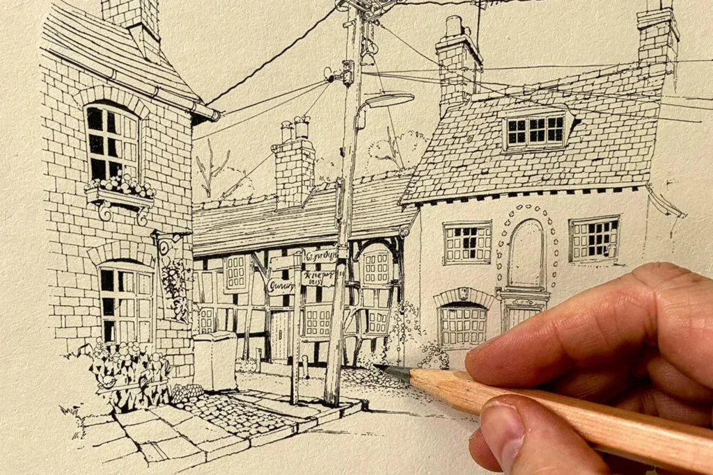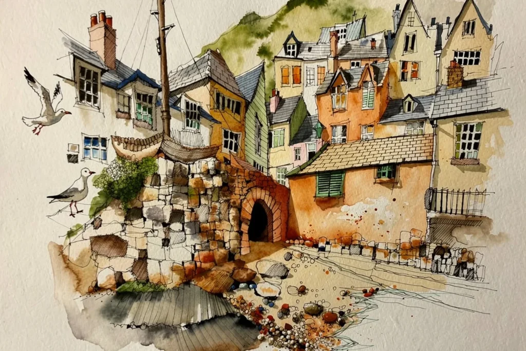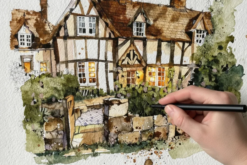
Adding detail with fine liners means going back over your finished watercolour and tone with a fine liner pen, picking out the small things that tell the story of the place. It is Stage 4 of my four-stage process, and for me it is the most rewarding stage: the reward for all the work that came before.
What you'll need
- Permanent fine liners in a few sizes (I use 0.05, 0.1, 0.2 and 0.3 for detail)
- A sketch that has been through Stages 1 to 3
- Your grey Tombow brush pen, to soften marks back where you want to
- A reference photograph, if you are working from one
What is Stage 4 actually for?
Detail is not about adding complexity for its own sake. It is about finding the small things that tell the story of a place, and knowing how to capture them quickly and confidently, in the moment.
I think of it in three layers, and the order is the order I work in: storytelling, hatching, and negative space. Each one is a principle rather than a standalone exercise. Learn how to draw one kind of brickwork and you understand the logic that lets you draw any brickwork.
How do I choose what to draw?
This is the storytelling layer. Sketching on location means you are surrounded by impressions: sounds, textures, atmosphere. Detail is how you hold on to them on the page. It might be a hand-painted café sign with chipped paint, a tangle of ivy climbing a wall, or the shadow of a lamppost at an unexpected angle.
The best storytelling details are not always in the main subject. They are the moments in a scene that speak to its character. Good observation is not about looking for things to draw. It is about finding the moments that reveal the soul of a place.
Then edit. Think about how many pebbles you need to draw, and do fewer. The suggestion of a million pebbles reads more naturally than a carefully drawn hundred. I never count windows: if there are twelve panes and I have drawn six, that is fine. A sketch is not a census.
How do I use hatching for tone and texture?
I use hatching for two reasons: to introduce tone, and to introduce texture. It darkens an area, and because it is so different from the watercolour and brush pens that came before, it also makes the image richer and more varied.
My hatching is always parallel lines going in one direction. Cross-hatching is something a lot of artists use brilliantly, but it just doesn’t connect with me, so I don’t use it.
- Pen size: I usually use a 0.1 or a 0.2, occasionally a 0.05. I rarely hatch with a 0.3, because that is getting too heavy.
- Layers: go back and forth across the shape for one layer, then go over it again to deepen the tone.
- Direction and spacing: it does not have to be diagonal. Vertical hatching can suggest direction or the grain of a surface. Put the lines close together for dark, then ease them apart for a gradual fade from dark to light, which gives a sense of three-dimensional form.
- Speed: work quickly. Speed gives hatching a fluid, natural feel. Done slowly, it can look stiff.
It is especially useful in the Detail stage for telling surfaces apart. A little hatching in one brick, none in the next, and suddenly they are telling different stories.
How do I use negative space to give things definition?
Negative space means drawing the space around or between things instead of the thing itself. A palm tree is a good example. I draw a selection of the golden brown leaves at the bottom in N15 as one continuous line, without lifting the pen, which keeps it from getting too neat. I shade some of them in with N60, which is the positive shape. Then I do the negative: instead of drawing a leaf, I draw the space between leaves, and add a little fine liner work so you get real leaf shapes rather than just gaps.
Where the leaves overlap, you get wonderful abstract shapes you can fill in. It becomes about picture-making rather than accurate depiction, and it looks right anyway. If you keep every leaf separate with no overlap, it looks far too simple.
The same idea works on old walls. For sandstone that has stood for hundreds of years, I put down a light tone, then shade the negative space between large, random, interlocking blocks. Going back over it with the brush pen picks up some of the fine liner ink and smudges it in slightly. That smudging is authentic: it gives you an ancient, worn, organic quality.
How do I work through the detail stage without overworking it?
Work in passes, and go round the whole sketch each time.
- First pass: touch base. You are not finishing anything yet. You go around the whole sketch, checking in on every part, lifting everything to the same level of attention. Nothing gets neglected and nothing gets overworked.
- Second pass: go deeper. You are still moving around the whole sketch, but the observation is more considered. Hold the pen high up the barrel, loosely, for a fluent line. Hold it close to the nib and everything seizes up.
- Third pass: the final push. Everything is in place, and the question is how far you can take it. Keep asking: is there more here?
You know you have done enough when you look for the next thing to do and nothing comes. That is the moment to put the pen down.
Which pen size for which job?
You want a range of line quality, with subtle lines and strong lines living side by side. A 0.1 gives you the whisper and a 0.3 gives you the statement. The contrast between them is what gives the sketch its sense of depth and visual hierarchy. I reach for a 0.2, probably my favourite size, for picking out individual courses of stone, and a 0.1 for finer work such as roof tiles, where nothing heavier will do.
What goes wrong?
- Drawing everything. Do fewer pebbles, fewer windows, fewer leaves. Select and simplify.
- One line weight. Use a fine pen and a heavier one together so the lines have a hierarchy.
- Treating detail as a single pass. Go round the sketch three times rather than finishing one corner at a time.
- Hatching slowly. It looks stiff. Keep the rhythm going.
Try this today
Take a sketch that has finished Stage 3. Go round it once with a 0.2 and a 0.1, touching base on every area. Go round again, and this time hatch one surface and leave the one next to it plain. On the third pass, choose one shape, a wall or a cluster of leaves, and shade the space between instead of the thing itself. Put the pen down as soon as you look for the next thing to do and find nothing.
Where does this fit in the four-stage process?
Detail is Stage 4 of the four-stage process I use in all my courses: Big Shapes, Watercolour, Tone and Shade, Detail. It comes after simplifying the scene into big shapes and adding tone with brush pens, and it is the stage that gives a painting its personality. To see the whole process on a real subject, my free Beddgelert Bridge course works through every stage (it is opening soon, and you can leave your email on that page to hear when it does). You can also explore all the painting workshops.
Free course, opening soon
Ready to paint your first complete picture?
This free course takes you through every stage, from first pencil mark to finished painting. It is not open just yet: leave your email and I will let you know the day it opens.
Notify me when it opens